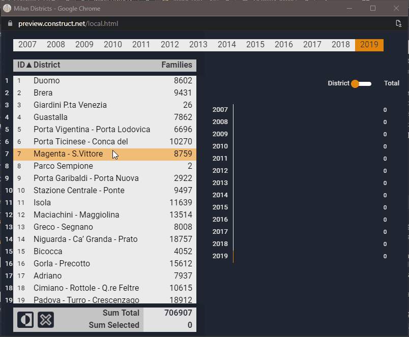
Last week I was happy with my experiments with Svelte, not this week. I made several attempts but nothing really presentable. I’m running into some of my limitations, and with some limitations of Construct 3. For this reason, after a few days I decided to complete an old idea: an app to show the demographic trend of the districts of Milan.
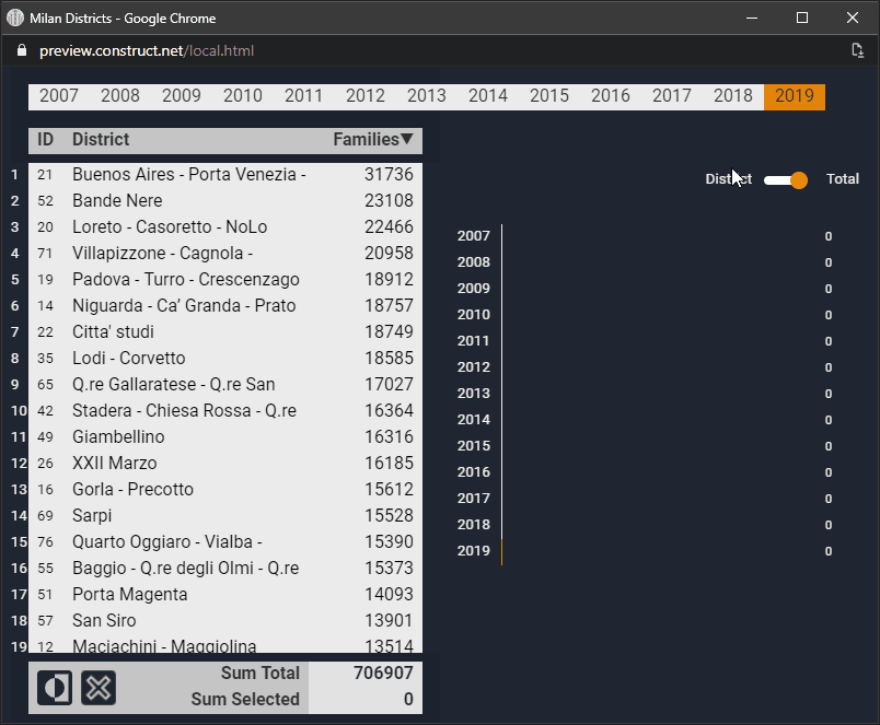
The operation is quite simple. On the left there is a list from which to choose the district, on the right a graph that updates dynamically. The top menu is used to change the analysis year. There are two cool things about this template. The first is how to create a scrollable list with Construct 3. The second is how to draw bar graphs (histograms) in C3.
I start with the scrolling list.
I got the idea while watching a Bart Alluyn video. It is conceptually very simple: you create a draggable element in only one direction. Then put two sprites on top to hide the element. And then you add a check to prevent the list from going too high or too low. It’s easier to explain with a drawing:

The two upper and lower limits are used to understand when to block the scrolling of the element. This is the only part where you need to use an event sheet:

It is not necessary to use a lerp function but I think it is advisable. It allows you to add a touch of elegance to the movement of the list:
I also found the part relating to histograms interesting. Especially because I took inspiration from a repository related to Svelte: Pancake. The idea behind it is to use divs to draw graphics using CSS features. This way you can avoid drawing directly on a Canvas and solve some formatting problems. Rich Harris explains this well in a very interesting article, A new technique for making responsive, JavaScript-free charts.
Obviously this technique does not work natively with Construct 3, although it deserves to be investigated a little further. But starting from that reading I decided to use the Tiled Background plugin as a basis for creating the columns of the chart.
The code is very simple:
HistogramBar: set width to NewWidth
Then I extended this concept with some additional events that allow you to change the size of the bars based on the relationship between the families of the selected neighborhoods and those of the city:

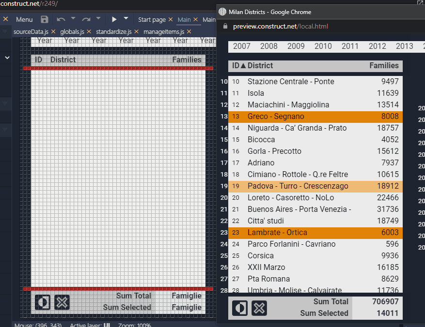
I’m done for today. In the source file that I uploaded to GitHub there are some JS functions to simplify data acquisition and list sorting. But they are marginal to this article.


