Sooner or later I will have to find the time to report what I am learning in these months. For example, that it is very difficult to predict how long it will take to complete a task.
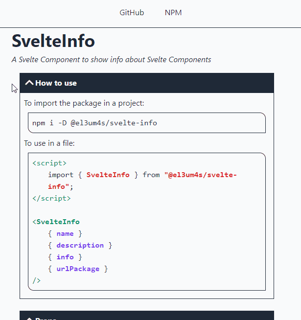
My last idea (creating an automatic system to document Svelte components) is longer than I expected. The technique is not very complicated but there are too many details that I had not foreseen. Also my desire to understand how things work is leading me to take a long time to recreate some basic elements. The last in chronological order is the accordion: an element that you can be open and close with a click.
What I want to build
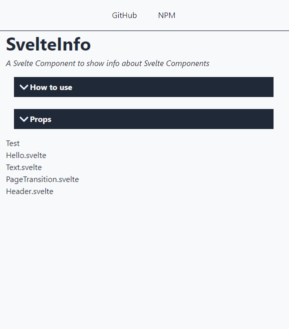
Something simple, which does not depend on other libraries. Something which is quite light and customizable. Svelte makes it very easy to create. And TailwindCSS allows you to manage CSS styles.
Let’s start from the structure
The basic structure is very simple, there are only 2 parts:
- one to use as the component header to insert the section title;
- the other is a simple slot: you can hide and show the content.
Of course, without adding any CSS styles or actions, the result is quite disappointing:

Let’s add some styles
I add some styles to highlight the title of the element and its margins. For this component I want to use a monochrome style. I am attracted to this kind of use of colors, but that’s another story.
So I start by coloring the title:

I can’t add a css style to the slot. But I can put it in a div and stylize that:

Open and close
Svelte allows you to hide and display an element of the page in a very simple way. Using a simple if...then...else condition tied to a prop I can check its status:

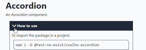
Let’s add a rotating icon
I need a way to open the element with a click. To do this, I need a button and an animation to highlight the click. I found the video by Johnny Magrippis (How to: Svelte Hamburger Menu Animation 🍔):
I recommend watching the video. To begin with, I need another component, Chevron.svelte, in which to insert an svg image:
I’d like to add a few styles to integrate it into the title of the main component:

The purpose of this icon is to be a button: when clicked, it opens or closes the underlying part of the accordion. So I put it in a button element and add two props to it:
I use the open prop as a CSS class. In this way, when the element is open, I can change the icon. I want to rotate it 180 degrees. So I add some CSS styles useful for this purpose:
Let’s add an action to the component
Now that the icon does its job I can go back to the main component and insert an action:
By clicking on the icon, I can finally open and close the accordion:
Let’s add a transition
The component works but it is not very nice to see a part of the page suddenly appear and disappear. To fix this I can use one of Svelte’s features, the transitions:
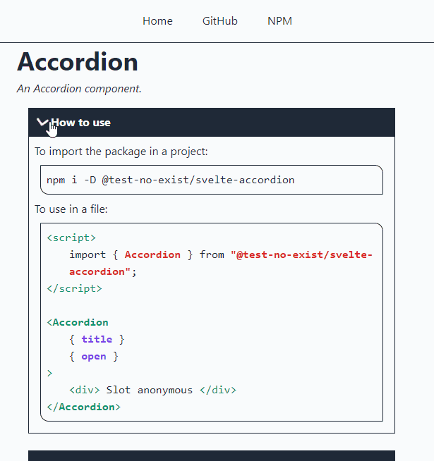
And here is the final result:
As always, the code is available and downloadable from GitHub:


